NAS - Illmatic (1994)
- 12 mag
- Tempo di lettura: 2 min
Aggiornamento: 22 mag
RELEASE: april 19, 1994
LABEL: columbia records
PRODUCERS: dj premier, large professor, pete rock, q-tip, l.e.s.
PHOTOGRAPHY: danny clinch
ART DIRECTION: aimee macauley
LOCATION: queensbridge, nyc
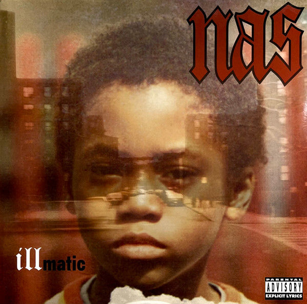
CONCRETE INNOCENCE.
Zero photo studios. Just memory. The Illmatic cover wasn’t staged; it was pulled from a family drawer: a private snapshot taken by Olu Dara, Nas’s father. In 1994, while rap was chasing tough poses and gold chains, Aimee Macauley shattered the mold. She chose psychology. A seven-year-old Nasir Jones transformed into a symbol of urban resilience. The past as the only lens to focus the present.
THE GHOST IN THE GRAIN.
But there’s a shadow behind the image. The title is a cold tribute to Ill Will, Nas’s best friend murdered in the streets of Queensbridge. Illmatic. Automatic loyalty. The boy in the photo is the last glimpse of innocence before the trauma took over — a childhood frozen on film before the bullets started flying.
THE VISUAL ARCHITECTURE.
Danny Clinch turned intuition into a legend. No digital tricks — just raw, analog double exposure. Clinch fused Nas’s face with the intersection of 10th Street and 41st Avenue. It’s not a montage; it’s DNA. The projects emerge from the boy's mind, making the environment part of his body. It’s the visual narrative of grit: looking through the concrete to see the only way out.
DEFYING THE LABEL.
The creative process was a battle against the industry. Columbia Records originally pushed for a standard "tough guy" shot — Nas standing in the cold, looking menacing. Macauley and Nas fought for the childhood portrait, convinced that the contrast between a kid's face and the harsh reality of the projects was more "gangsta" than any pose. They wanted the viewer to feel the weight of the environment on a soul that hadn't been hardened yet.
TYPOGRAPHY OF DUALITY.
Macauley’s minimalism seals the deal with a brutal typographic contrast. Three weights, three worlds. The NAS logo in Old English screams street authority. Below, the title splits the word in two: an elegant Serif for the poetry of "ill," and a cold, industrial Sans-Serif for the mechanics of "matic." An aesthetic that echoes the rigor of Blue Note jazz covers, elevating rap to an iconography of memory.
THE BLUEPRINT.
Macauley didn't just design a cover; she built a blueprint. By dropping in April '94, Illmatic set the stage for everything that followed. From Biggie’s Ready to Die (released five months later) to Lil Wayne’s Tha Carter III and Kendrick’s GKMC, the "childhood portrait" became the ultimate hip-hop trope. Before Illmatic, you showed your face to prove you were tough. After Illmatic, you showed your past to prove you were real.
THE SONIC ARCHIVE.
Ten tracks. Zero filler. A documentary in sound. Nas was 20 when he torched the rulebook with a cinematic lyricism never seen before. Produced by the NYC dream team, the record sounds like concrete at sunset: warm, dangerous, melancholic. 100% real. If you want to understand why rap is art, hit play.


Commenti